Always.
So, I was on a big shoot recently and had set up an on-location shot with some gorgeous scenery in the background. Zero wind, gorgeous Spring day.
I set the light up with a softbox (d'oh--a sail, naturally) and we were running to get a sunset shot in, so I thought, "Just leave it and sandbag it after you grab your people" and walked away. On the way back to the setup, walking up a curving driveway, I looked for my light and didn't see it. My stomach dropped.
I ran out ahead of the clients and sure enough, my light had fallen over BACKWARDS onto a decently busy road. I'm amazed no cars hit it in the 2 or so minutes that we gathered everyone. I managed to beat everybody there, pick it up, and have a full blown panic attack in the 30 seconds it took for everyone else to get there.
Thoughts: I'm a professional! I know what I'm doing! Why didn't I sandbag this! My sandbags leak! Why do they leak?! Why was I worried about sand leaking when we're outside? Does it mean I'm not a professional that my sandbags leak! I'm a professional, dammit! This doesn't happen to professionals! I'm definitely not a professional. Hello, Imposter Syndrome, my old friend.
People get in a hurry, and make mistakes. Even Annie God-Dang Leibovitz makes mistakes. Well, her assistants do (why get your hands dirty?), then she goes bankrupt. But I digress.
I went to test the light and despite a couple plastic fittings flying off into the sweet hereafter, it worked!
We got the shots, then I quietly panicked the rest of the night wondering if I'd be able to fix it. Not sandbagging this light was about a $600 mistake on lights that they don't make anymore and I can't afford at this moment to replace. Duly noted.
On to the surgery!
Robert, my darling, patient, engineer-brained fiancee helped me put it back together again.
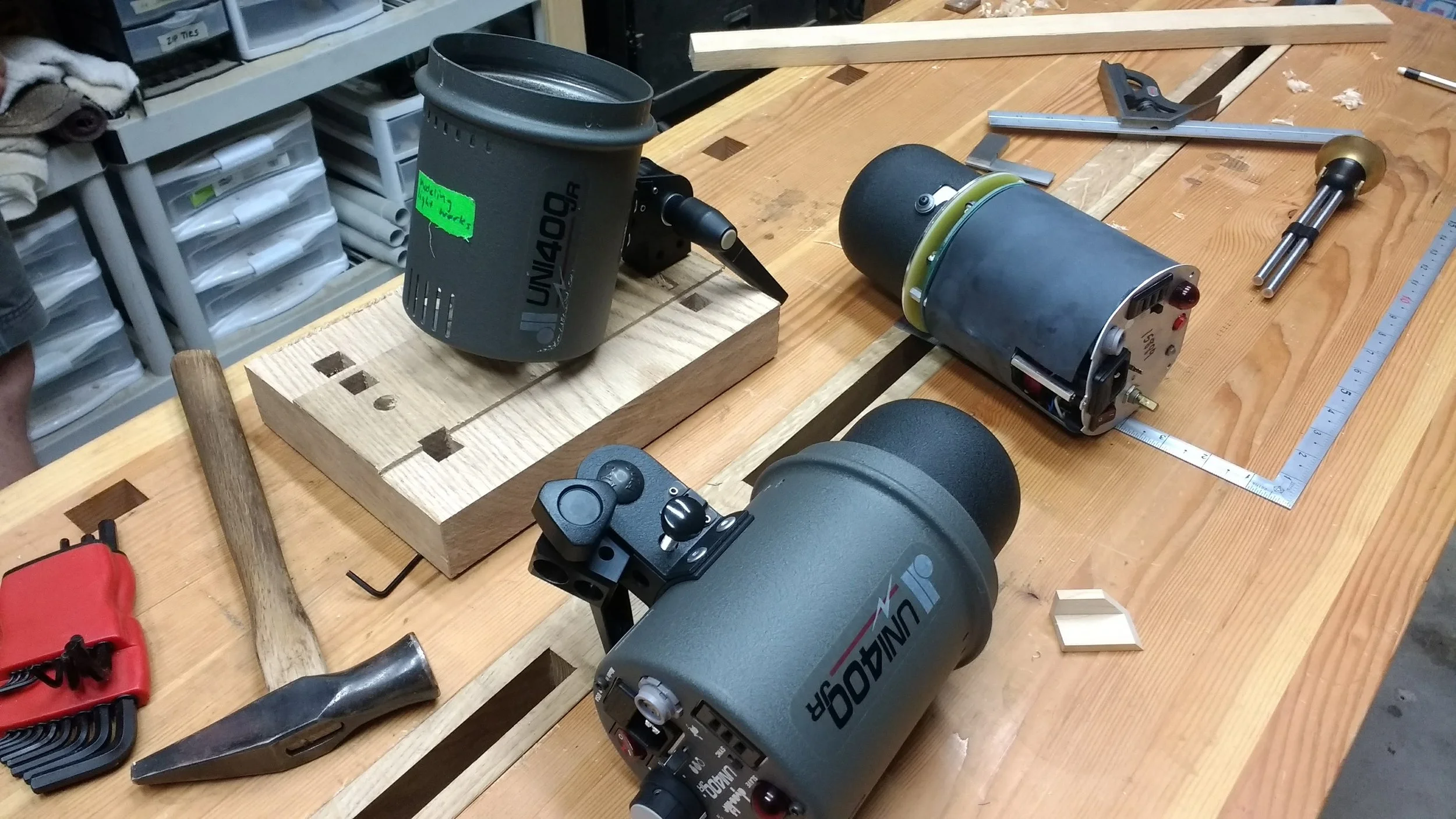
The damaged light on the right. The outside shell had been badly bent, as well as the metal plate on the back. The jackrabbit plug's housing was broken & as well as the fitting for the discharge/dump button.
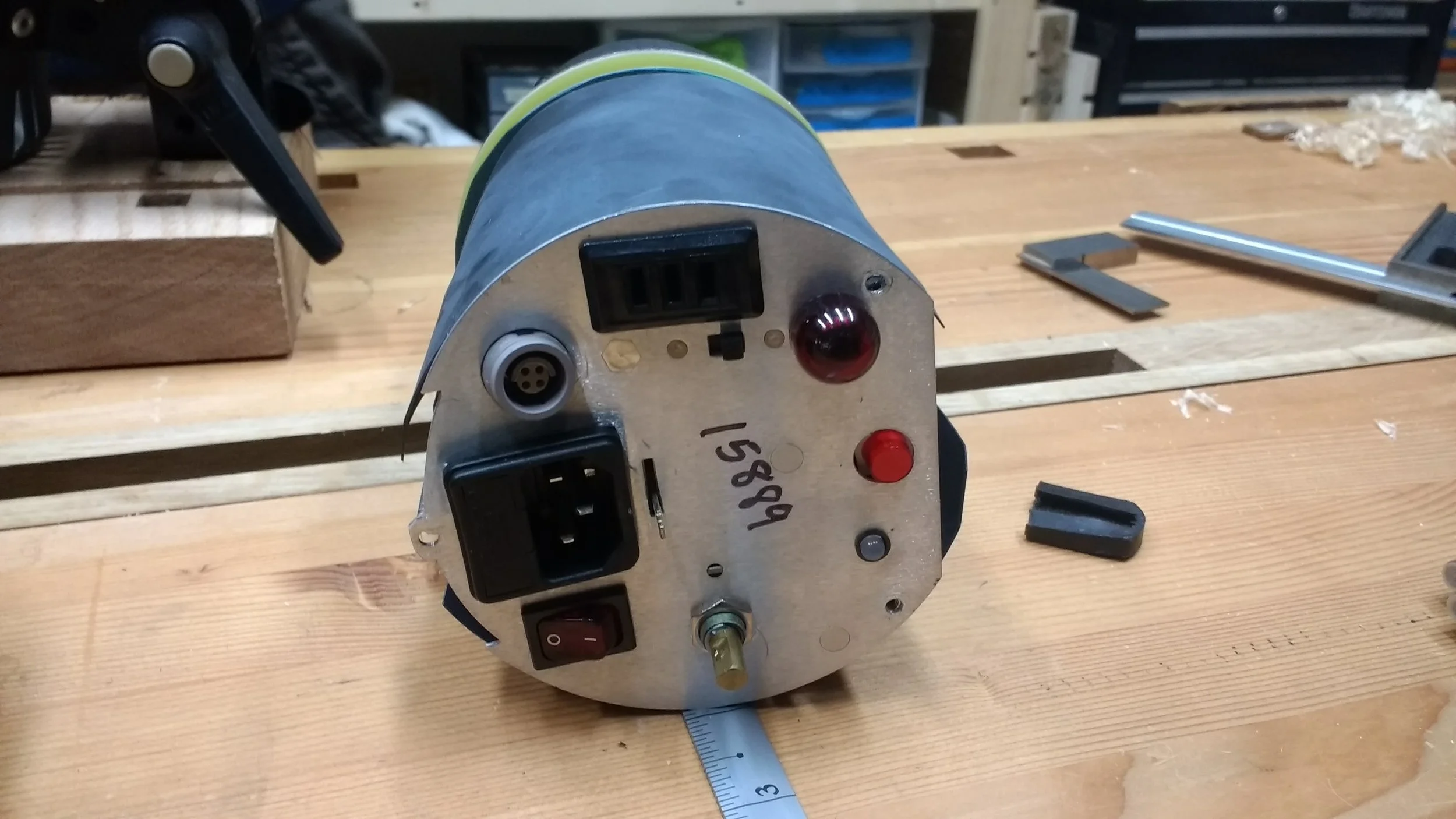
Back of the light head fixture, the metal plate was bent around the power plug, Jackrabbit plug, and the red button/dump button was totally unattached and just floating there.
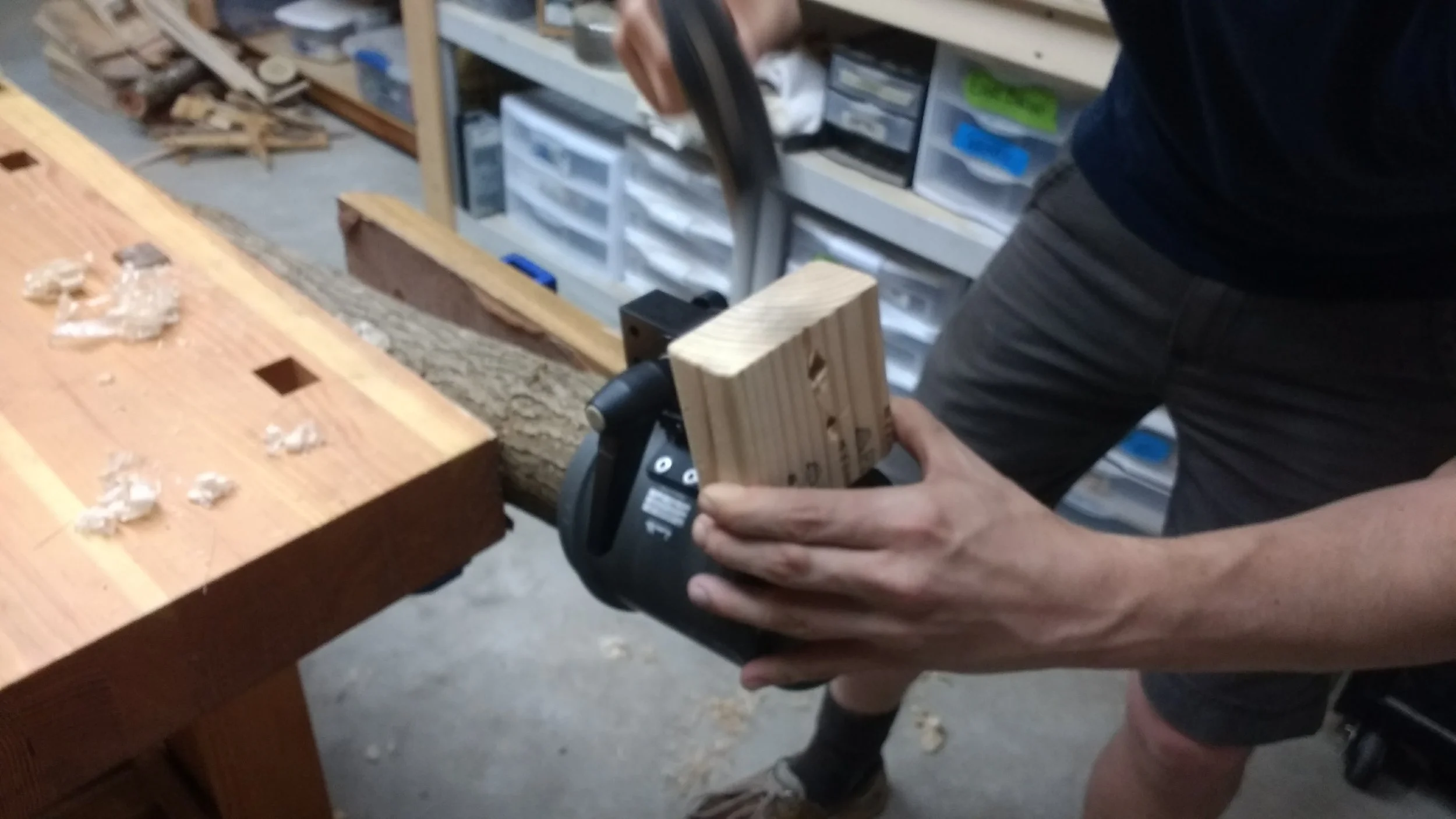
Robert hammered & flattened out the metal on the bottom using a block of wood
Pounding the metal back into shape... Helps to have a huge tree limb in the shop!
Out of focus: definitely not a professional
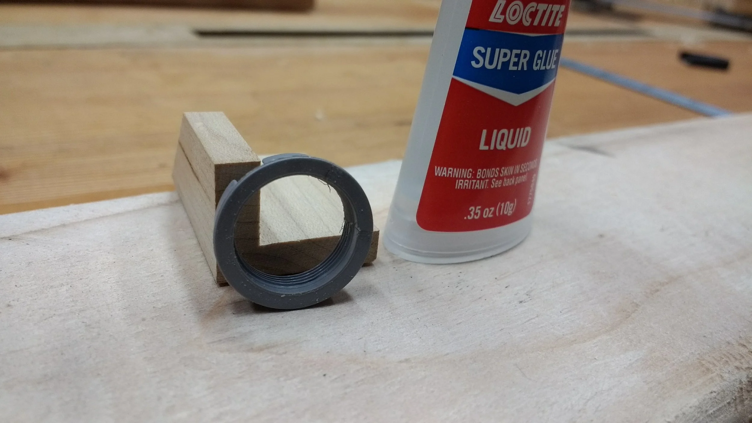
I tried gluing this back together, then it fell apart into more than two tiny pieces, never to be joined again. Alas!

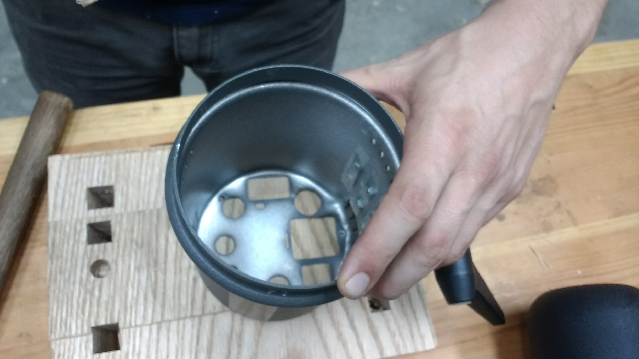
Checking in the un-broken light head to figure out how in the world the "dump" button (classy) is held on to the plate on the back of the fixture.
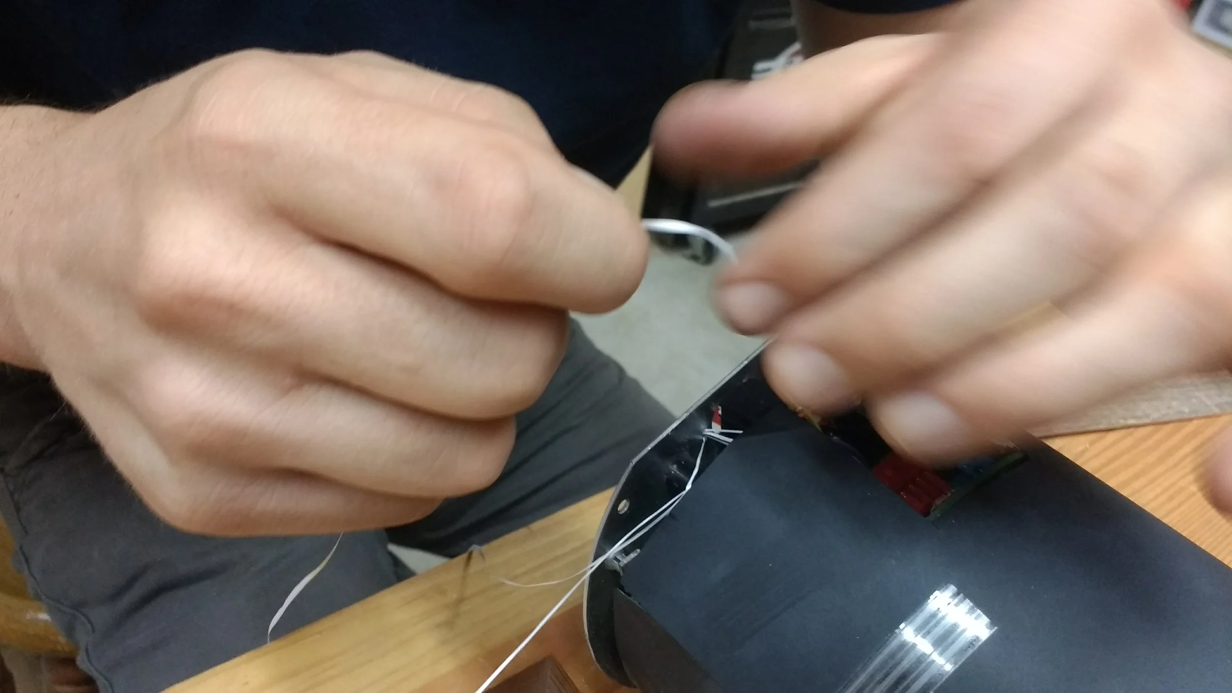
Robert repaired it with dental floss. Really.
I added a 5% "minty lighting" premium to my shoots after this

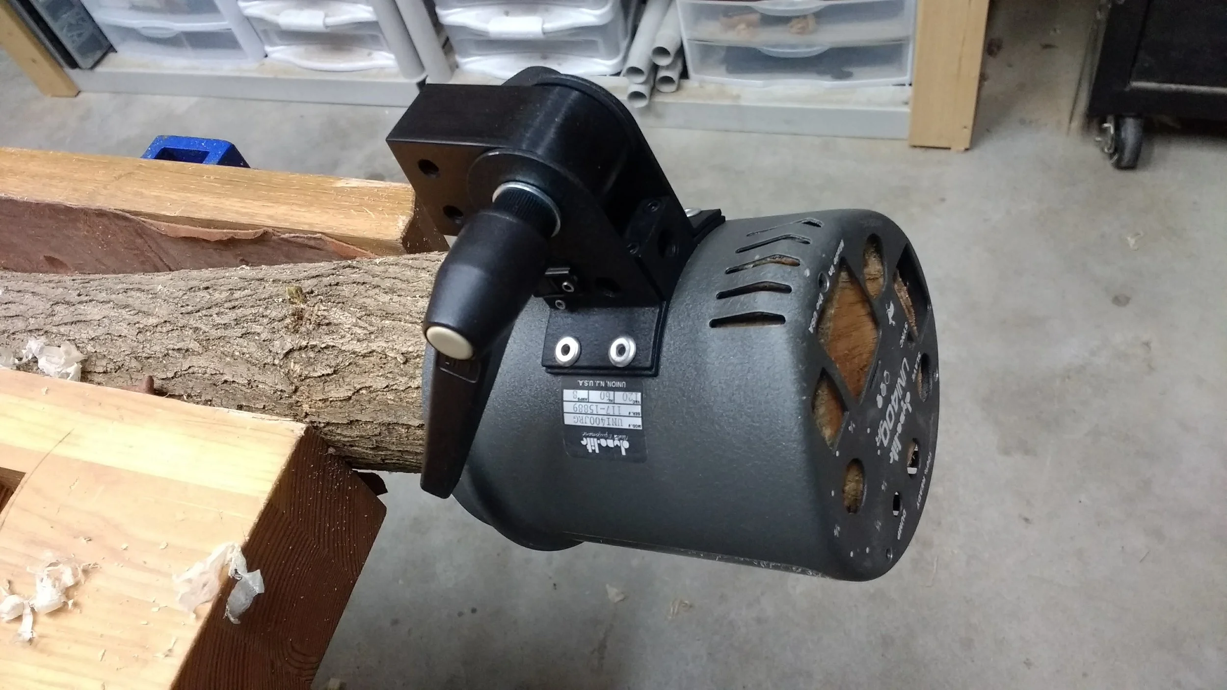
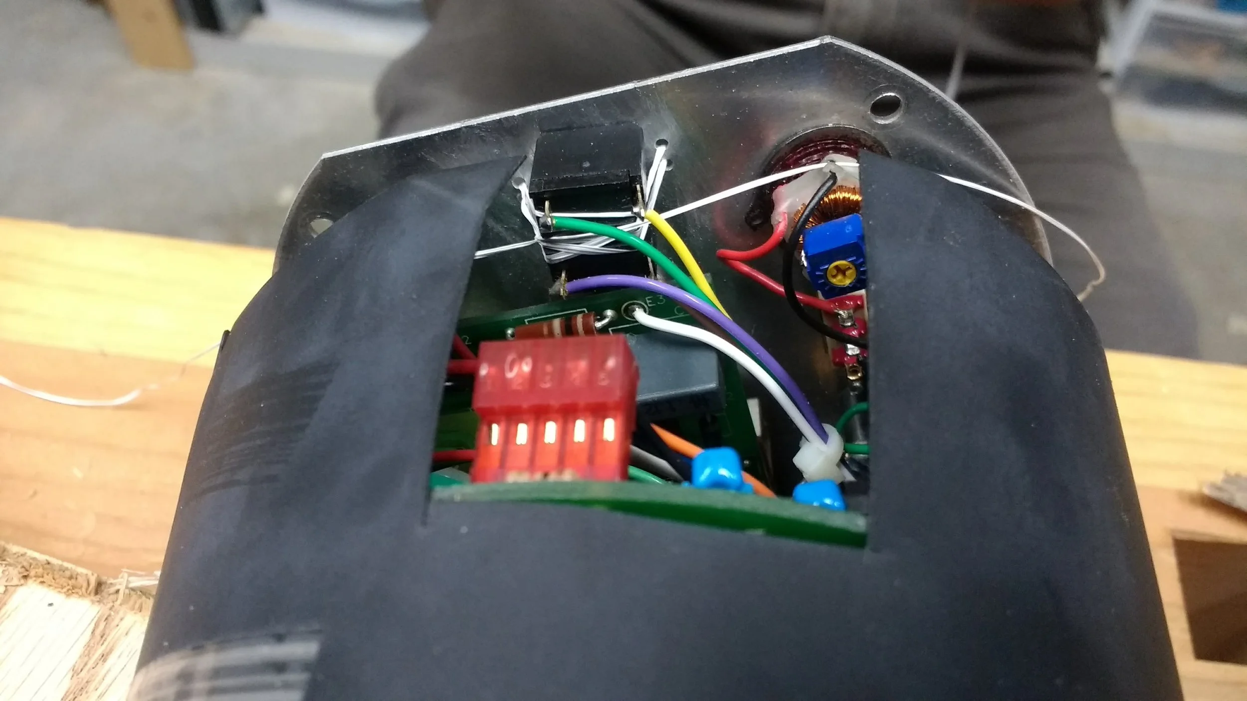
The light head, mended.
The red button is the "dump" button (to release built up power when powering the flash head down a stop or more) and the grey/purple plug is for the Jackrabbit/battery. He used a c-clip on the Jackrabbit plug to secure it to the metal plate.
The moral of this story is: slow the hell down. Don't get in a hurry and don't forget your g-d sandbags!! Nobody will be irritated when you spend 1 minute making sure the lights don't fall on them or fall and break and thus render the shoot a bit silly.
It also helps to have a supportive significant other or friend who has an entire woodshop and knowledge of their tools and who will calm you as you panic and pace.
Thanks for reading & don't let the bastards get you down.