
I'd like to share a bit of the process that goes into making a cyanotype, plus my latest print. If you want to skip all these words and dazzling insights, then feel free to scroll on down. Perhaps I'll have a video to share at some point.
I think a lot of photographers would love this process because it's very straightforward, decently simple to produce a good print (especially if you have experience with negatives or printing in the darkroom), and it's affordable in terms of material costs compared to just about everything else you can do in photography.
All you really need to get started are the chemicals, good watercolor paper, a hake brush, some superglue (for hake brush), gloves, glass or plastic cups to mix solution in, stirring rod, droppers, a dark room (it doesn't have to be 100% light tight), two sheets of glass or clear plexi glass, sturdy clamps, and the sun. Unlike darkroom printing, which requires 100% absolute pitch black darkness except for the amber safelight, plus some serious gear, multiple sinks, temperature gauges, gallons upon gallons upon gallons of water, etc. (or just an enterprising/Macguyver-ish setup, which I've seen on Youtube plenty).
A good resource for cyanotype chemicals if you're in the market: Bostick and Sullivan
An aside: as photographers, I don't think we often consider the price to the environment of printing or of photography as a whole. The chemicals themselves which can be quite gnarly, pouring chemicals down the drain, exposure to ourselves and others, and holy crap the water usage. The Onion had a particularly funny piece about our upcoming water wars...but I digress. Cyanotypes are much less gnarly than most printing processes and as far as I understand, are not harmful to the environment.
I can go more in depth on cyanotypes at some point, but know that I am by no means an expert. I picked up The Book of Alternative Processes and a used copy of Alternative Photographic Processes and read the chapters on cyanotypes several times and took notes. I watched many youtube videos, scoured small websites & blogs, and then finally decided to try it. I've been printing this way for about 11 months now and I made Christmas cards last year from a hand drawn "negative" on parchment paper. So I've done about 80 or so cyanotype prints thus far and finally feel like I have a process that is pretty good.
The negatives are a different story. I am not very techy, but what I can tell you is that there are many wonderful guides online and I primarily just use a cyanotype curve in Photoshop, plus print at 16-bit depth at the highest resolution my Epson printer will go and it has worked out decently well so far. I would like to take an actual, in-person negative making class because I hate computers and have to work to not destroy mine when I start going in depth on printing.
I use OHP negative sheets, found here: Pictorico Transparency Sheets
Also, for watercolor paper, right now I am using Strathmore Bristol which is such a great deal I almost feel like I've made a deal with the devil to obtain it. It's smooth, hot pressed paper which gives just a bit of the grain of a watercolor paper, but without mega fibers showing through. As of this exact moment in time, I prefer this to the higher end watercolor papers I've used simply because it is affordable and looks wonderful and doesn't get fuzzy after multiple washings, although it does get very fragile around the corners after a soak.
ANYWAY! The reason I laid all that out is this. Photography, even if it's "simple" or requires few things, requires so much trial and error and money and time. As an artist, people do not care what you are doing for the most part, so it's up to the artist to make the viewer understand and care, if at all possible. This was not an overnight success for me, I have tons of awful prints I shoved in a bin along the way. I have spent more money than I'd like to admit on watercolor papers, hake brushes, negative sheets, and my fiancee, of Robert Hazelwood Woodworking, and I made the printing frame (by hand, with hand planes, hand saws, etc. in an un-air conditioned wood shop in Oklahoma in the summer, by God) and UV unit that I use to print, featured here:
Print frame on top, UV unit underneath. Made by me and Robert Hazelwood
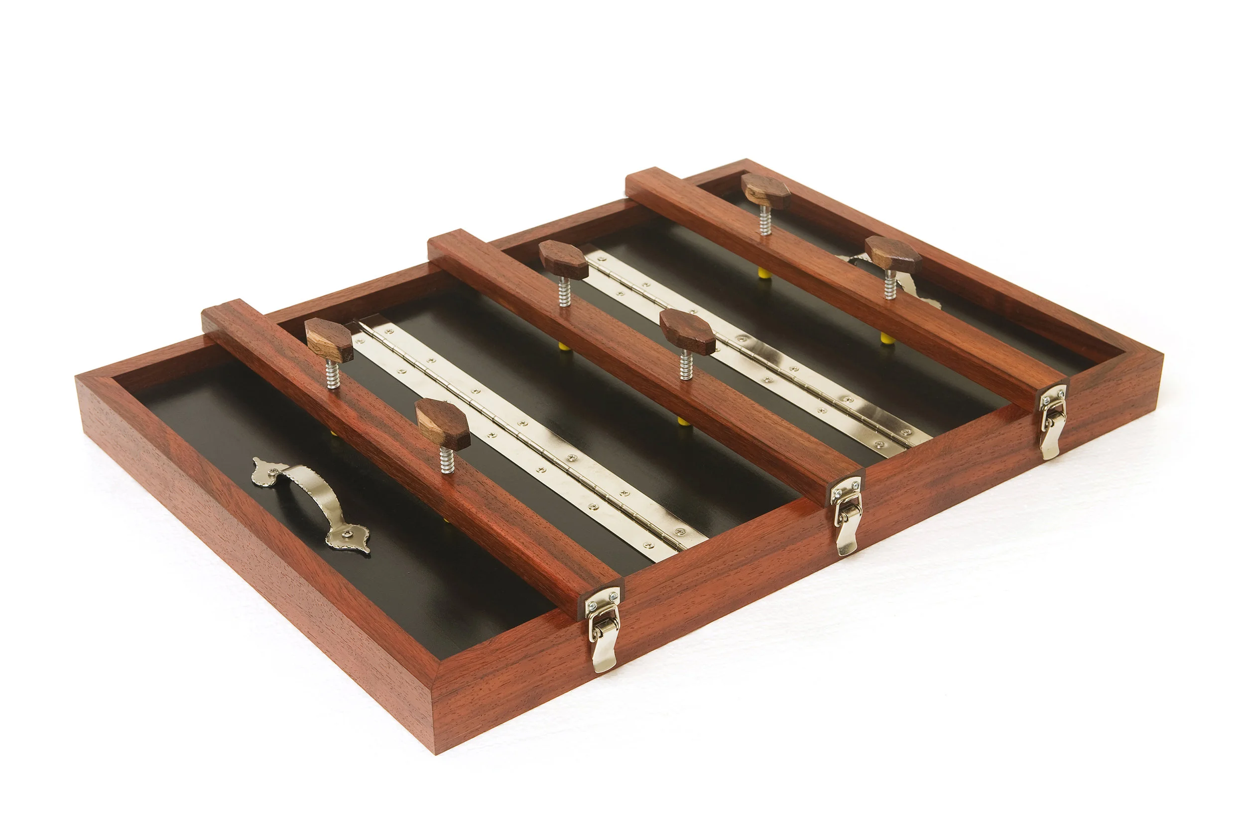
Printing frame made from Padouk wood. The shop looked like it was covered in cheeto dust after planing.
So without further ado, here is my latest effort with cyanotypes. I've seen the work I've put in pay off and I'm thrilled about it.
The original Cyanotype:
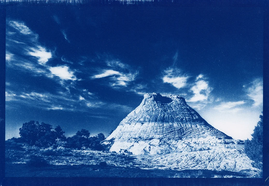
I like the deep blue very much and think it works well with this image. But I also wanted to see how it would turn out toned, the process of toning you can see below.
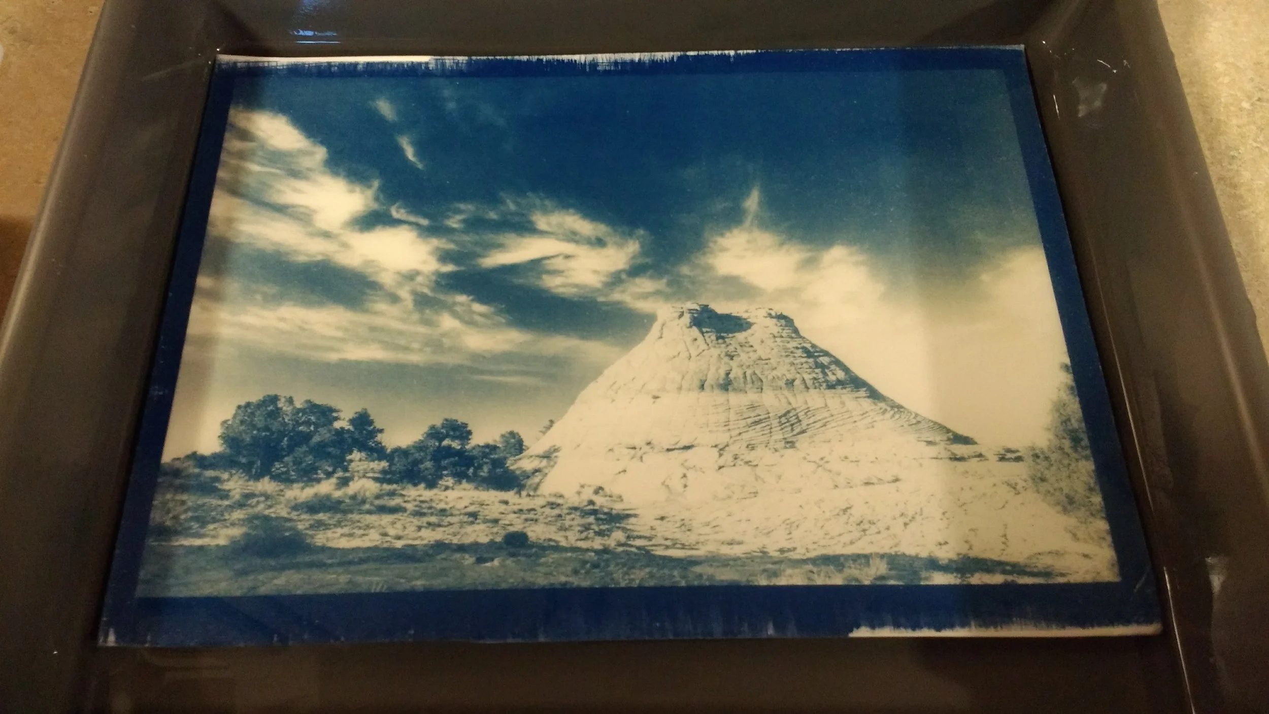
Rinsing in plain water after the bleaching stage. Bleaching is accomplished with sodium carbonate or washing soda.
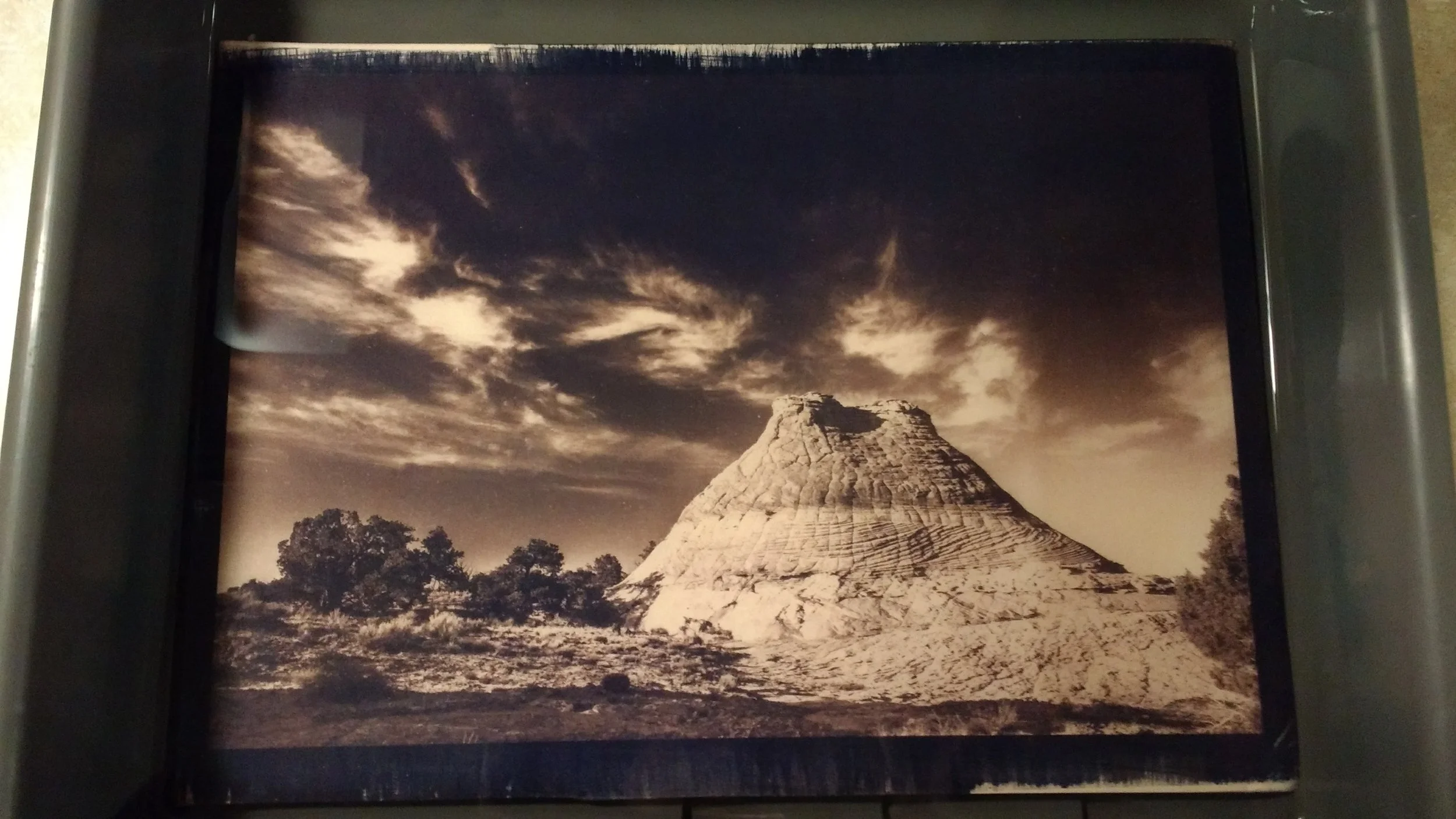
Final rinse after toning in green tea for 30 minutes.
And for the final result:
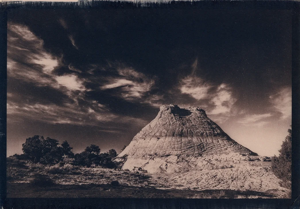
Note the deep eggplant tone with very gentle pink highlights
I love this print and I'm atrociously proud of it. I'm hoping to some day complete a cyanotype exhibition of my toned prints based around a theme of conservation or something else I dream up. Thanks for reading! Don't let the bastards get you down.